

The Remarkables ID //
the remarkables group

What we did
Branding
Graphic Design
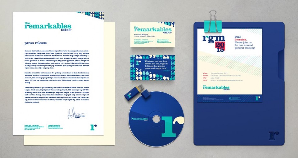
Stationery
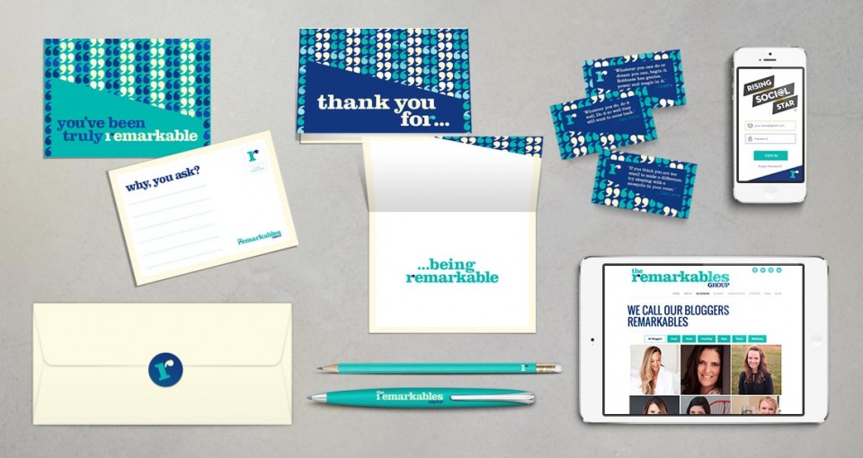
Postcards
Industry
Bloggers
Social Media
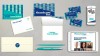
A bright, fresh and colourful identity for an equally bright group of people. The Remarkables represent high-end bloggers and connect them with like-minded brands.
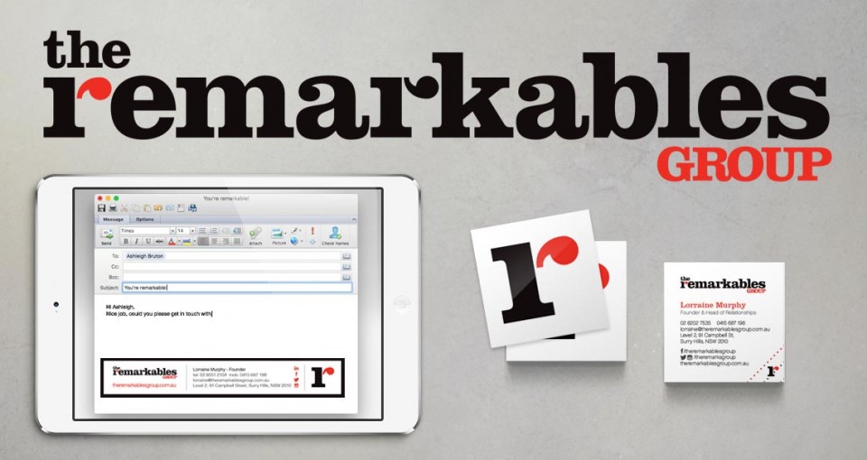
As the brand is all about communication and conversations, we designed a logo and monogram that integrate quotation marks into the letter ‘r’. Yes we know that technically it should probably be “double” quotation marks, but that didn’t look good. The ‘r’ at the start of remarkables opens the conversation and the second ‘r’ closes it. Good chat.
The branding was very well received and now the company is moving in a new direction so the brand colours and style are also evolving. Watch this space.